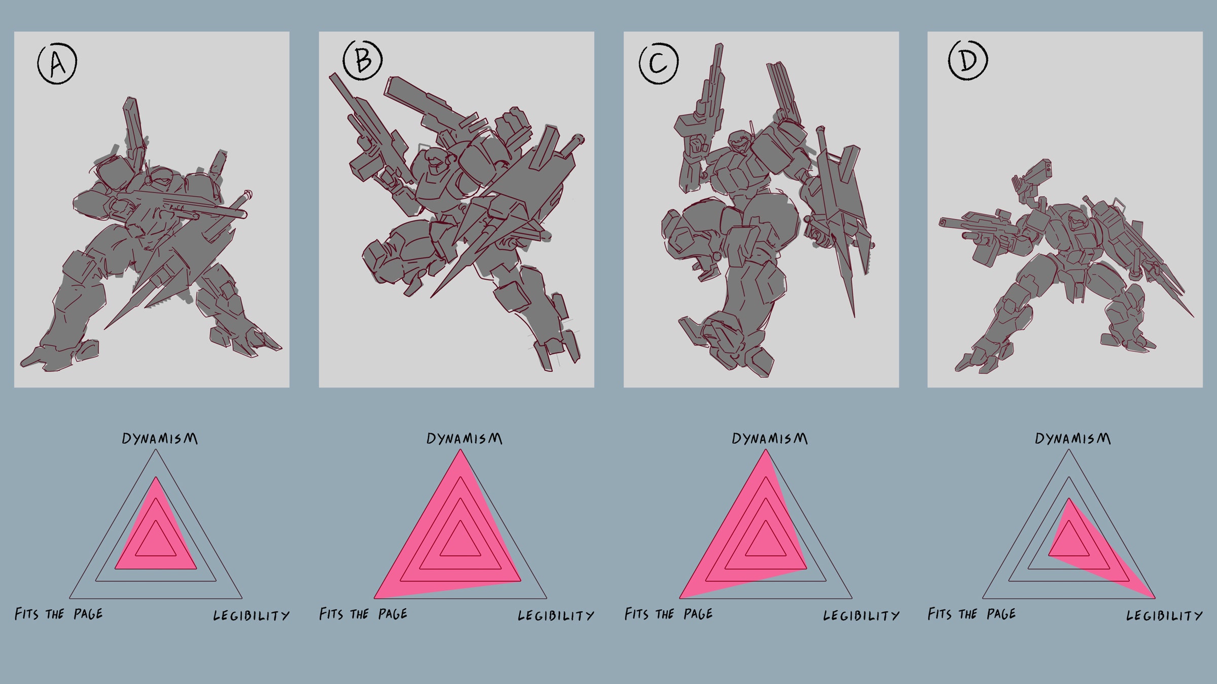
Overthinking things is part of the job
Originally posted May 9, 2024

When I'm working on key art, I have to balance my personal aesthetics with what's best for the piece. You want a cool pose but you should also clearly show the design, which don't always align. Then you have to consider the dimensions it'll be displayed.
Printed in a book? Then you're likely working within a letter size page. A double page spread is doable but then you have to consider the crease. Digital? What the size of the display? Monitor, TV, or phone? Board or card game? Probably more horizontal but also it's going to end up pretty small so a crop will probably be preferable to a full body shot.
To put it another way, Okawara and Obari both have an important role to play in their field. Obari's baroque dynamism might inspire and enflame the heart, but Okawara's art informs the fundamental truth of the design. The toy manufacturers, animators, and 3D modelers of the world know how vital a clear (if uninspiring) piece of art can be.
If you were hypothetically working on the key art for a pivotal and iconic Lancer design for an upcoming book that'll typically be displayed as a digital PDF in the dimensions of a standard letter size page, what would you pick?
